Rebuilding Seedly Rewards, from a 20-level system that couldn't scale to a sustainable tiered economy
registered users expressed interest pre-launch
launched with us on the launch day
increase in engagement 6 months post launch
Seedly used a 1–20 level system to reward community contribution, but it broke down as more users reached the top. I led the research and design to replace it with a sustainable and scalable rewards economy built to protect community trust while encouraging contribution.
Senior Product Designer. Led research and design end-to-end, discovery, wireframing, usability testing, final screens alongside a junior designer.
3 engineers. 1 PM. 2 Designers.
2022
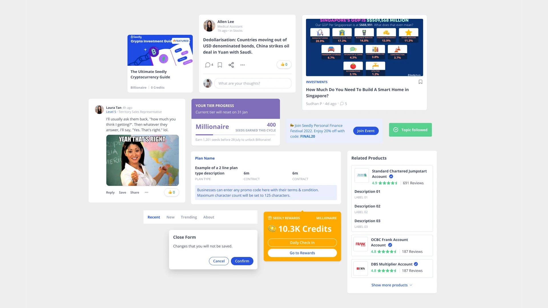
Seedly used Levels (1–20) and Rewards as the main mechanism to drive participation in its personal-finance community of hundreds of thousands of Singaporeans.
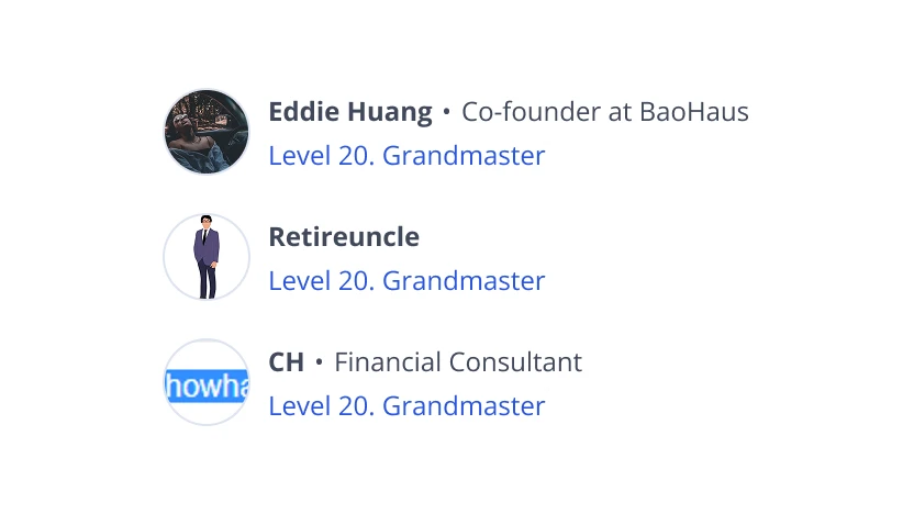
The level system didn't scale. As more users progressed toward the peak, the mechanism lost its motivating power and became unsustainable long-term.
Rewards had to mean something. Generic rewards weren't enough to keep loyal users contributing as they grew in their financial journey.
It tied into a bigger bet. The new system aligned with parent company Hyphen Group's wider Rewards objective.
How might we reward loyal users sustainably as they grow with us without diluting the community's quality?
Ran a visioning workshop with the PM, then discovery research, concept testing, and usability testing alongside a second product designer.
Rewards only motivate when they align with users' goals.
Top three wanted: financial-product discounts, monetary rewards, networking sessions.
Users didn't know the existing system, they benchmarked against the big names.
When prompted, they referenced Grab and Singapore Airlines Miles. A chance to design something they'd instantly recognise.
Users feared rewards would degrade the community.
Their biggest concern was gaming and spam lowering post and comment quality, a signal of how much they trusted Seedly, and what we had to protect.
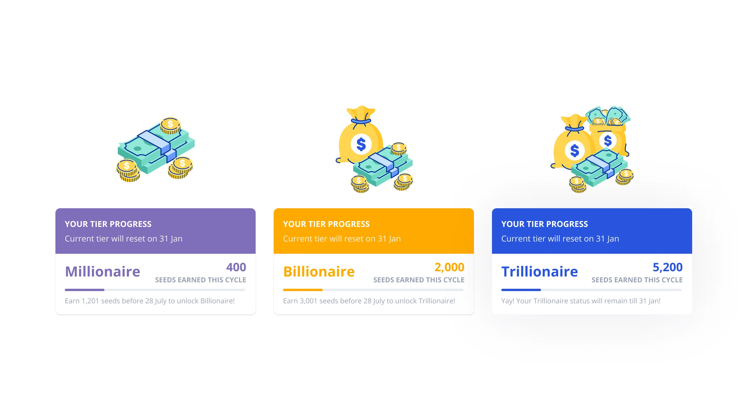
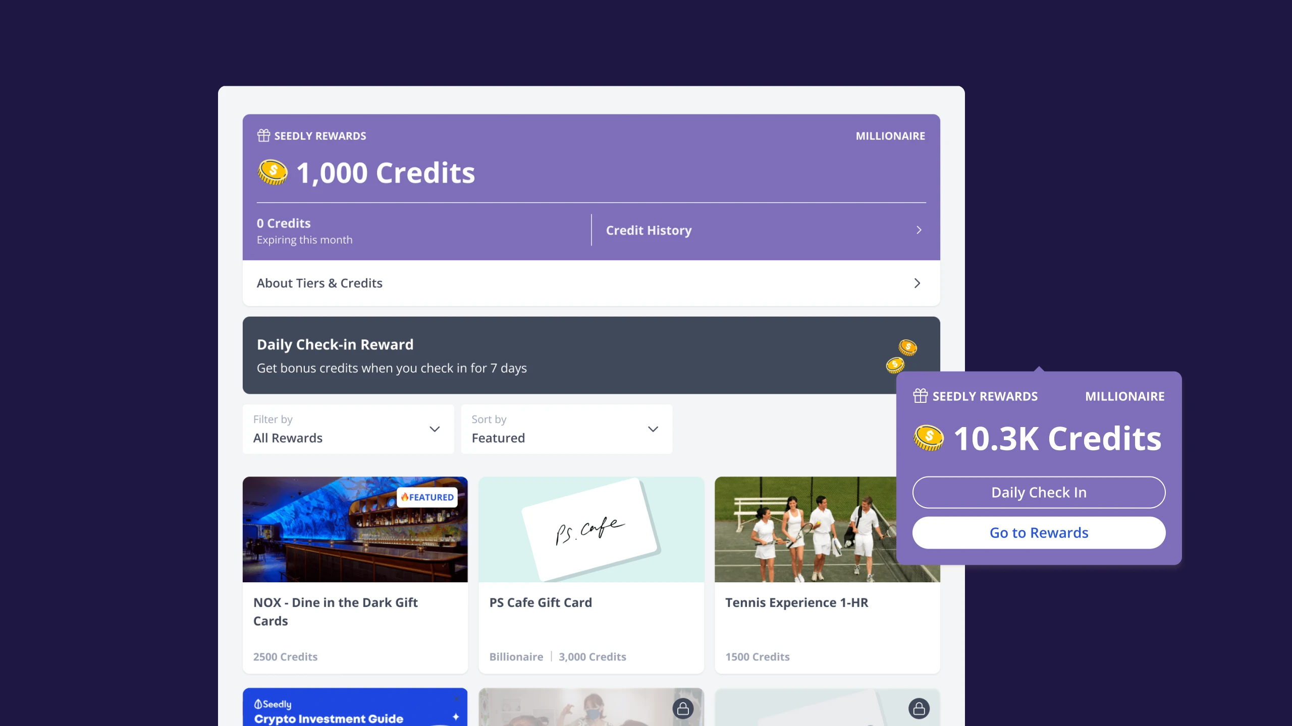
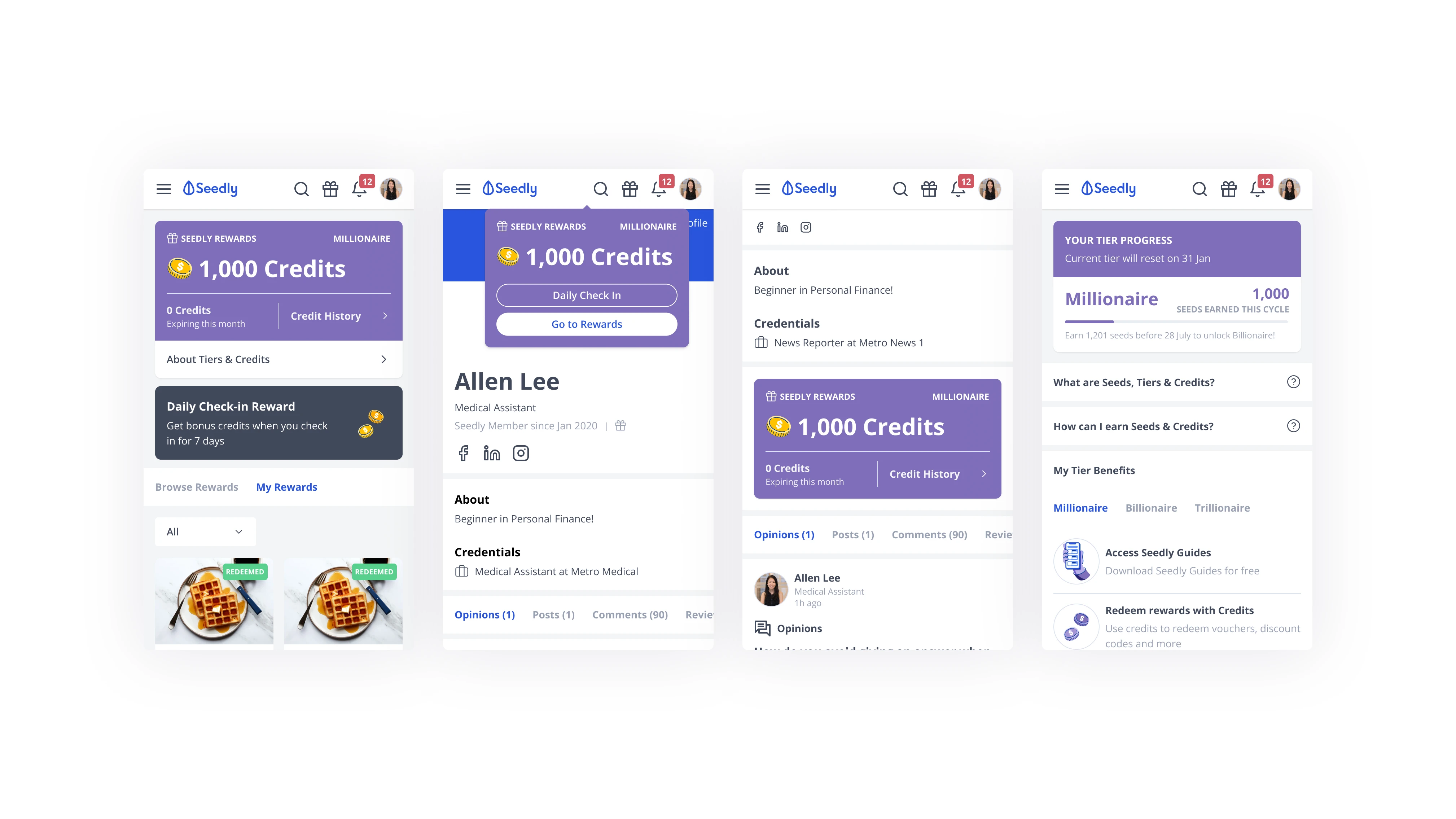
A tiered credits economy built to scale
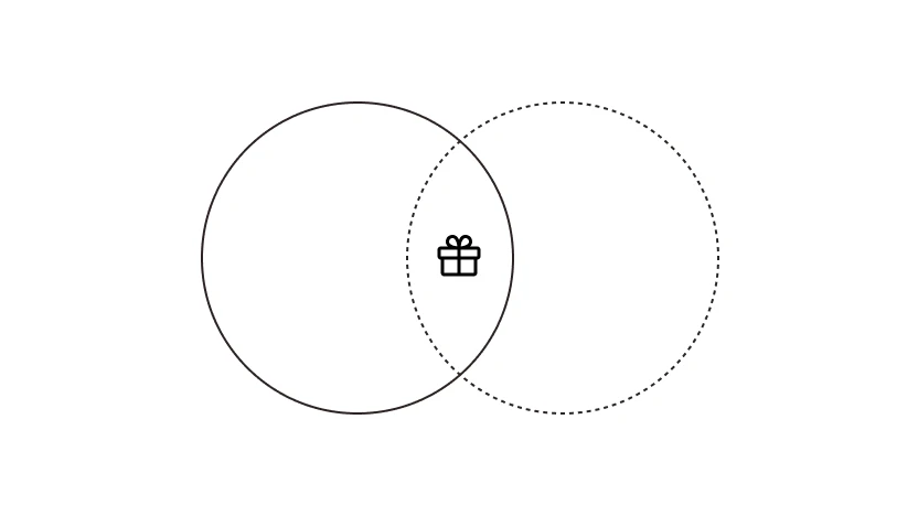
20 levels couldn't sustain motivation or growth. We replaced them with three tiers, Millionaire, Billionaire, Trillionaire, and split the economy into two currencies: Seeds (drive tier progression, reset each cycle) and Credits (spent on rewards, expiring and capped).
WhySeparating progression from spending mirrors familiar industry loyalty models, keeps the system sustainable at any user volume, and gives users a recognisable mental model.
Designing for trust
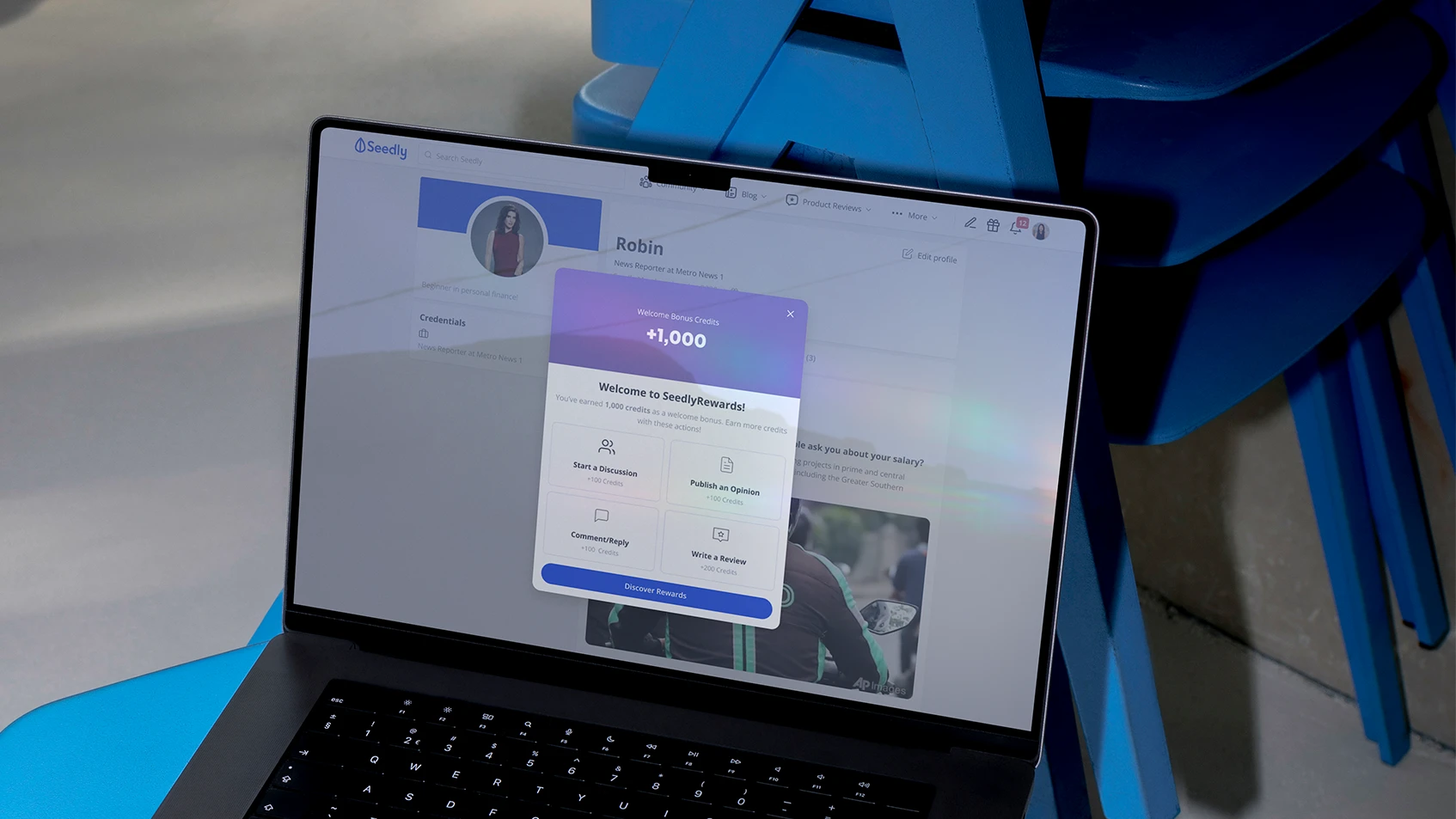
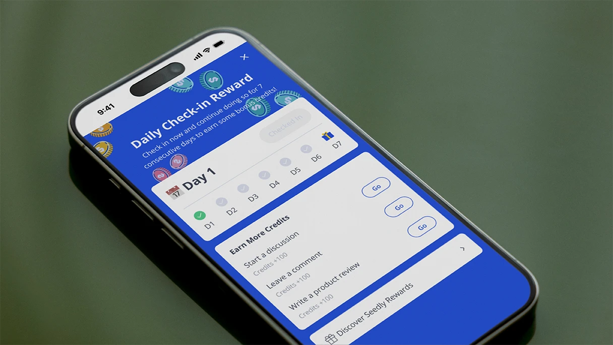
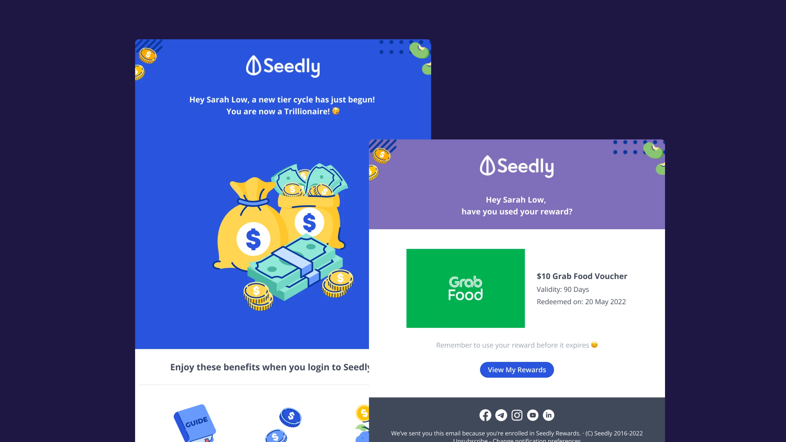
The rollout touched many user states and several products, easy to ship a pretty screen that breaks at the edges. Designed onboarding across every user state (existing, new-enrolled, new-not-enrolled, logged-out), pre- and post-launch flows, a daily check-in with a quick-entry point, and the supporting backend (Camelia CMS, Stash API, Sendgrid). New components from this work were contributed back into the shared component library.
WhyA rewards programme is a multi-product system with internal customers and edge cases. The leverage is in the system, not the hero screen.
Building repeatable pattern
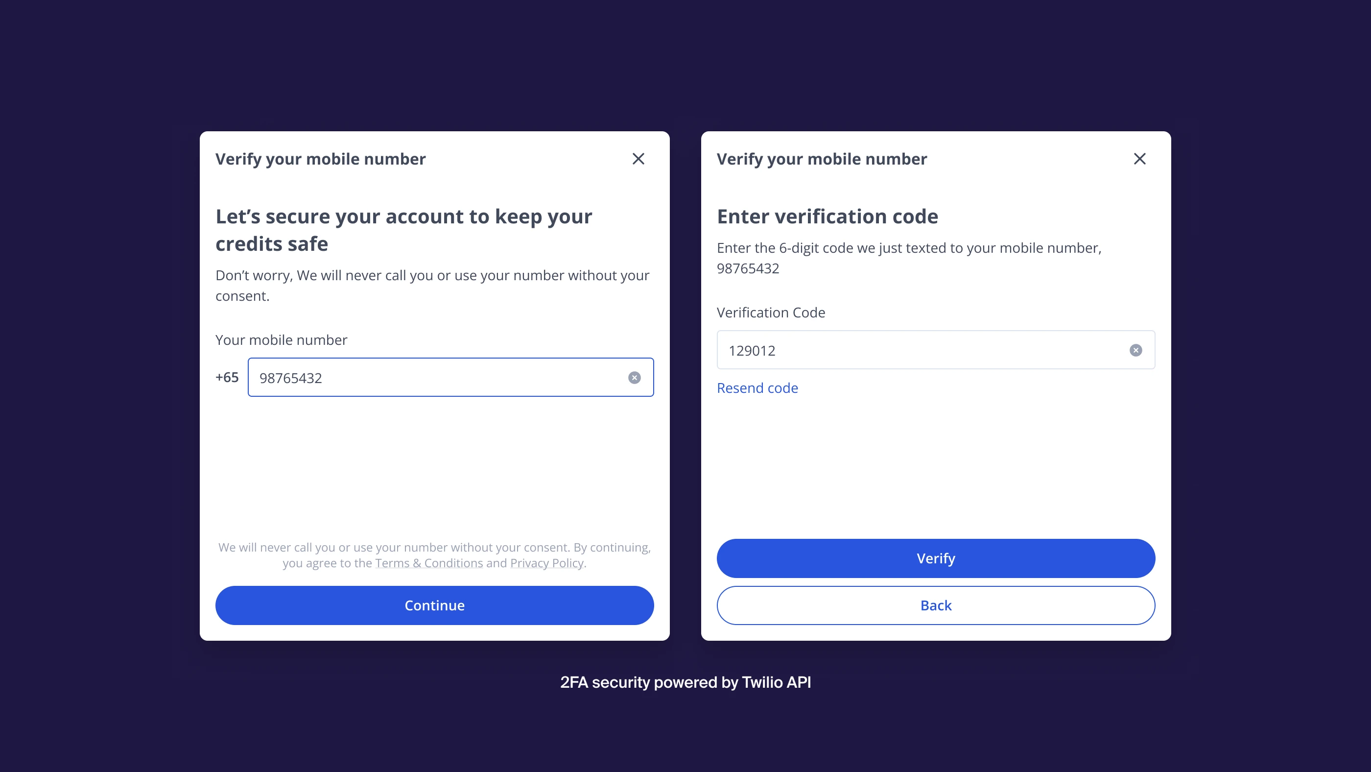
With real monetary value at stake, users feared gaming and spam, the exact thing that would erode community quality. Added Twilio-based 2FA mobile verification, framed as "keep your credits safe" and kept optional unless enrolling. In testing, a manual "mark as used" step confused users, so vouchers auto-mark as used on redemption, with an undo.
WhyProtecting trust was the real product requirement. Friction in the wrong place (manual marking) hurts; friction in the right place (verification) reassures.
Designing for delight
With real monetary value at stake, users feared gaming and spam, the exact thing that would erode community quality. Added Twilio-based 2FA mobile verification, framed as "keep your credits safe" and kept optional unless enrolling. In testing, a manual "mark as used" step confused users, so vouchers auto-mark as used on redemption, with an undo.
WhyProtecting trust was the real product requirement. Friction in the wrong place (manual marking) hurts; friction in the right place (verification) reassures.
Going beyond the web interfaces
The rollout touched many user states and several products, easy to ship a pretty screen that breaks at the edges. Designed onboarding across every user state (existing, new-enrolled, new-not-enrolled, logged-out), pre- and post-launch flows, a daily check-in with a quick-entry point, and the supporting backend (Camelia CMS, Stash API, Sendgrid). New components from this work were contributed back into the shared component library.
WhyA rewards programme is a multi-product system with internal customers and edge cases. The leverage is in the system, not the hero screen.
This project taught me that the system is the work, not the screen: most of my effort went into user states, redemption tradeoffs and the backend, the parts users never see but always feel. It was my first time mentoring, guiding a junior designer between handholding and challenging prompts, which taught me how I want to lead.