Building Seedly's First Design System, One source of truth for a startup that never had one
button variants consolidated into a single documented system
team grew through the system without breaking consistency
Seedly had grown for three years with no standardised system, leaving 19+ button types, inconsistent dropdowns and undocumented patterns scattered across the product. As the sole designer in a team of three, I used the Sketch-to-Figma migration as the moment to build Seedly's first design system: a visual audit, research into mature systems, a Figma component and pattern library, and full documentation in ZeroHeight that became the single source of truth for both design and engineering. It still anchored the product two years later, as the team doubled.
Sole designer in 2020, later one of two product designers as the team grew.
1 designer and 2 frontend engineers in 2020, later 2 product designers and 4 frontend engineers.
2020 → 2022
Seedly is the largest personal-finance community platform in Singapore. In 2020 it was still an early-stage startup, and three years of fast building had left it with no standardised system: a Sketch design kit, disconnected React components across web and app, and patterns documented nowhere.
The design problem. How might a tiny team build a design system that pays for itself, cutting the time we spend aligning components so we can spend it on the roadmap, without over-engineering for our stage?
Before touching the surface, I did the unglamorous work of understanding who would use the system, what we had to work with today, and what a three-person team could realistically maintain.
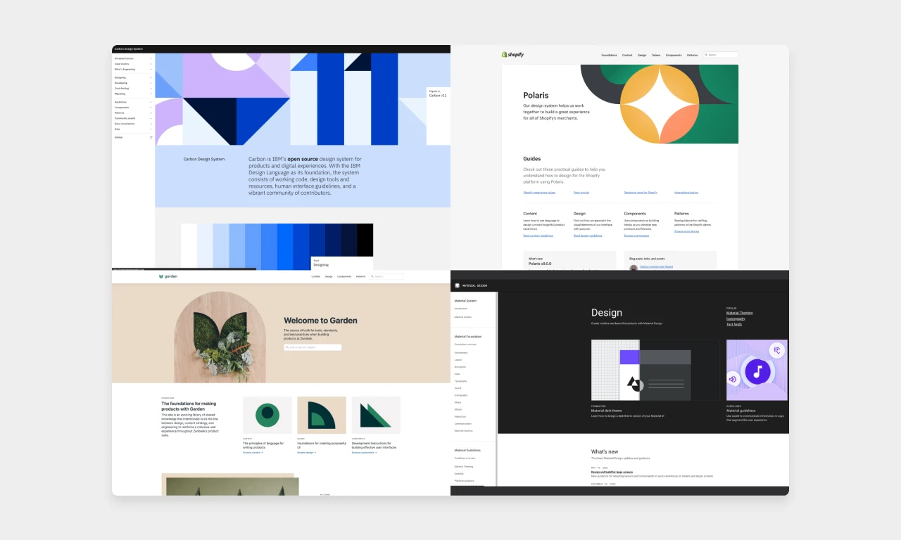
References, sized to our stage.
Each reference did a different job. Material informed interactions, Carbon informed patterns, Polaris informed content design, and Garden's lightweight docs suited a three-person team far better than a giant system would.
Accessibility as a baseline, not a phase.
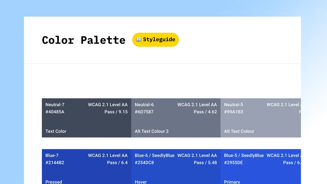
Accessibility was a pillar from the start. The baseline covered minimum readable font sizes, colour contrast, and clear hover and focus states, small initiatives that compound over time.
I studied how mature teams build and organise systems: GitLab's Pajamas, VK, Google's Material, IBM's Carbon, Shopify's Polaris and Zendesk's Garden. We chose four as close references and kept some of Seedly's own interactions where familiarity served users better.
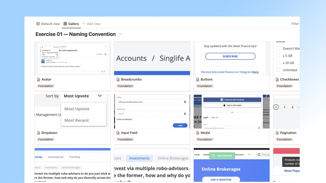
I followed Brad Frost's Atomic Design as the organising method, picked for how cleanly it lets a small team find and reason about components by complexity. From there, the work split into five threads that ran in parallel with the roadmap rather than blocking it.
Auditing
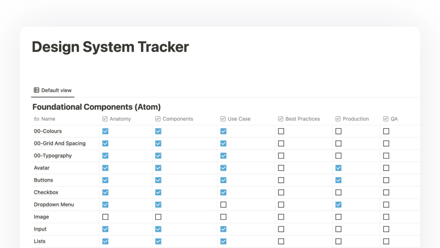
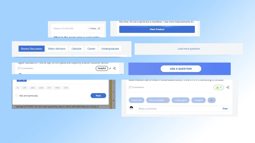
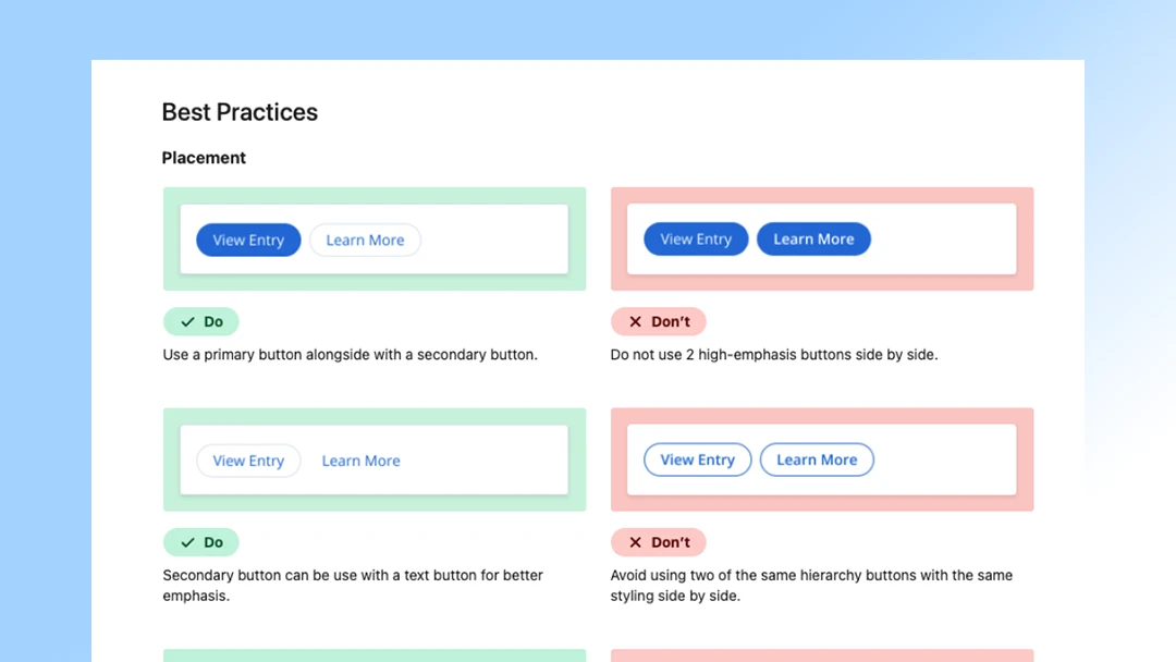
Started by pulling every live UI element into one canvas: 19+ button variants, 7 dropdown styles, undocumented modals and inputs. Seeing the sprawl in one place made the case for the system without needing a deck, and gave engineering a shared reference point for what we were collapsing.
Getting the team involved
Pulled the two frontend engineers in early on naming and structure, so the Figma library and the React components stayed in lockstep rather than drifting. They owned the code-side decisions, I owned the design-side, and we met in the middle on tokens and component APIs.
Getting accessibility checked
Baked accessibility into the tokens themselves, not into a later QA pass. Minimum font sizes, WCAG-AA contrast on every colour pairing, and clear hover and focus states were all defined at the foundation layer, so every component that used them inherited the baseline by default.
Documentation done
Used ZeroHeight as the single source of truth for both design and engineering, with usage rules, do-and-don't examples, and code snippets in one place. Kept the structure lightweight, in the spirit of Zendesk Garden, so writing and updating docs stayed a side-of-desk effort rather than a second job.
Expanding to molecules and organisms
Once the atoms were stable, started composing them upward into molecules and organisms tied to real product patterns, so the system grew alongside the roadmap. Each new feature contributed back into the library, which kept the system load-bearing instead of decorative.
A design system is never finished. It should keep developing rather than end as a one-off project, and I wanted it to grow into a dedicated product serving all four of Seedly's products. For a small team, lightweight beats comprehensive. Garden-style simple documentation fit us far better than copying a giant system wholesale.