Redesigning Creatz3D's Site as a Conversion Engine for High-Intent B2B Buyers
traffic to the high-intent "Contact Us" page
search CTR while impressions fell −27% by design
faster loads, removing friction for time-pressed buyers
Creatz3D's site generated only ~200 leads a year. It chased volume through gated brochure downloads while burying the path to a real conversation, and slow pages drove away the time-pressed engineers and procurement managers who actually buy.
Design lead at Underscore. Owned the redesign, information architecture and UX, and drove the migration strategy with the team.
1 designer. 1 dev.
Oct 2024
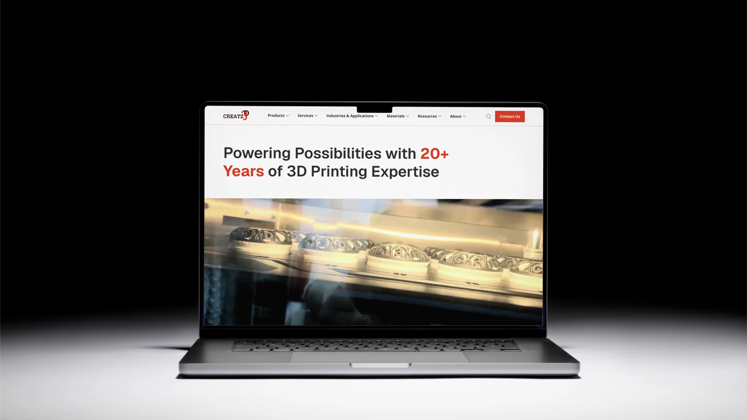
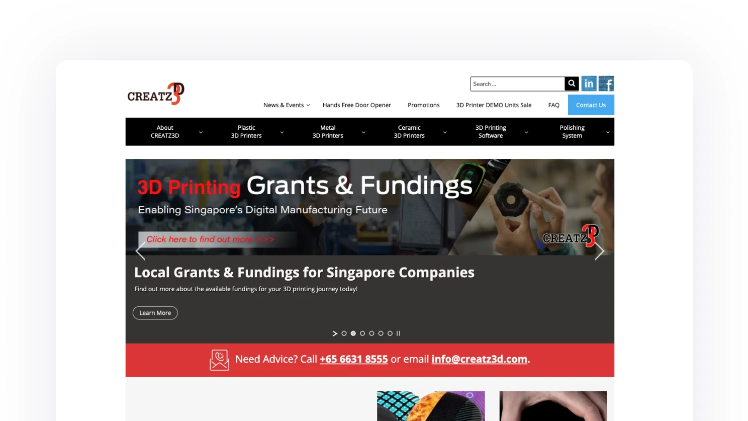
Creatz3D provides industrial-grade plastic, metal and ceramic 3D printing in Singapore, and is a partner to major global firms like Stratasys. Their 13-year-old WordPress site, built in their early years, had become an obstacle to the business.
Tedious to maintain. Simple updates demanded excessive time and technical caution from a single marketing manager, throttling marketing agility.
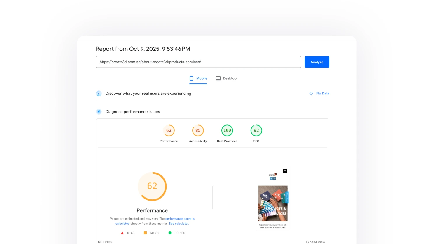
Slow, and B2B buyers feel it. Slow load times frustrated time-pressed engineers and procurement managers, the exact decision-makers the business needed to win.
How might we turn a site that chases lead volume into a conversion engine, bringing time-pressed B2B buyers to a real conversation faster, and with better-qualified intent?
A data-driven content audit and a performance-and-manageability strategy came before any visual design, so the migration was grounded in evidence rather than taste.
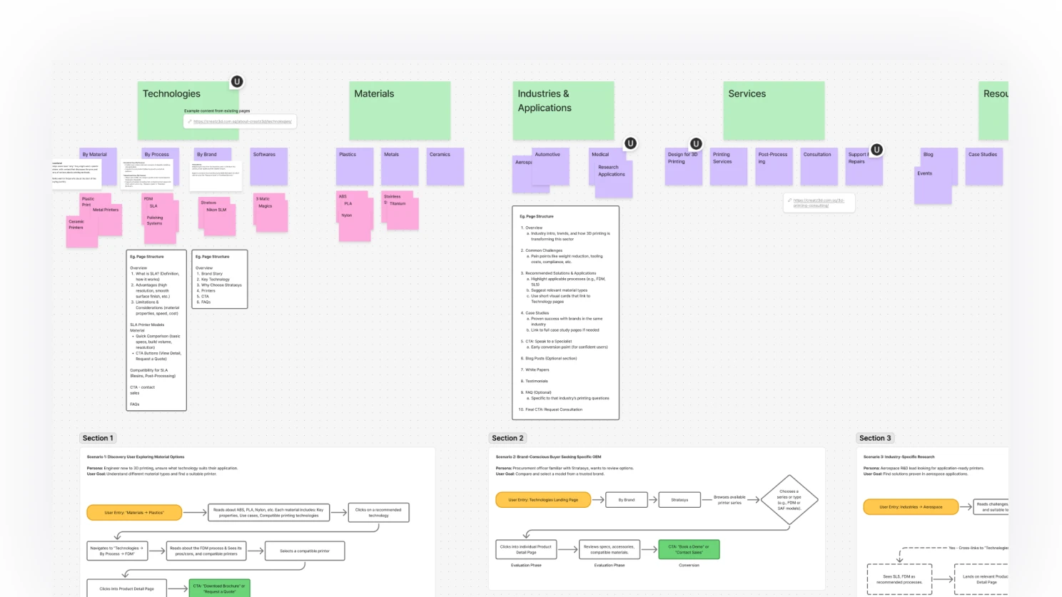
Most of the 800+ pages were dead weight.
The audit found hundreds of low-performing, outdated posts with minimal or zero views, so migrating everything would have been impractical and harmful to quality.
The real users are time-pressed B2B buyers.
Engineers and procurement managers needed to find the right information fast, which pointed the redesign toward speed and a simplified path to contact.
The CMS had to empower a team of one.
With a single marketing manager maintaining the site, manageability was a core requirement, not a nice-to-have.
A big reason for the shift to Webflow lies in the reliability to create, maintain, and scale the site using components and variables. This project prioritises a large amount of experience for the end-user which is a solo marketer in an SME.
Creativity within constraint
Set a tight token system and a small, opinionated component library so the marketer could compose pages confidently without breaking the visual language.
WhyConstraint is what makes a one-person CMS workable. The fewer choices on each block, the more consistent every page ends up.
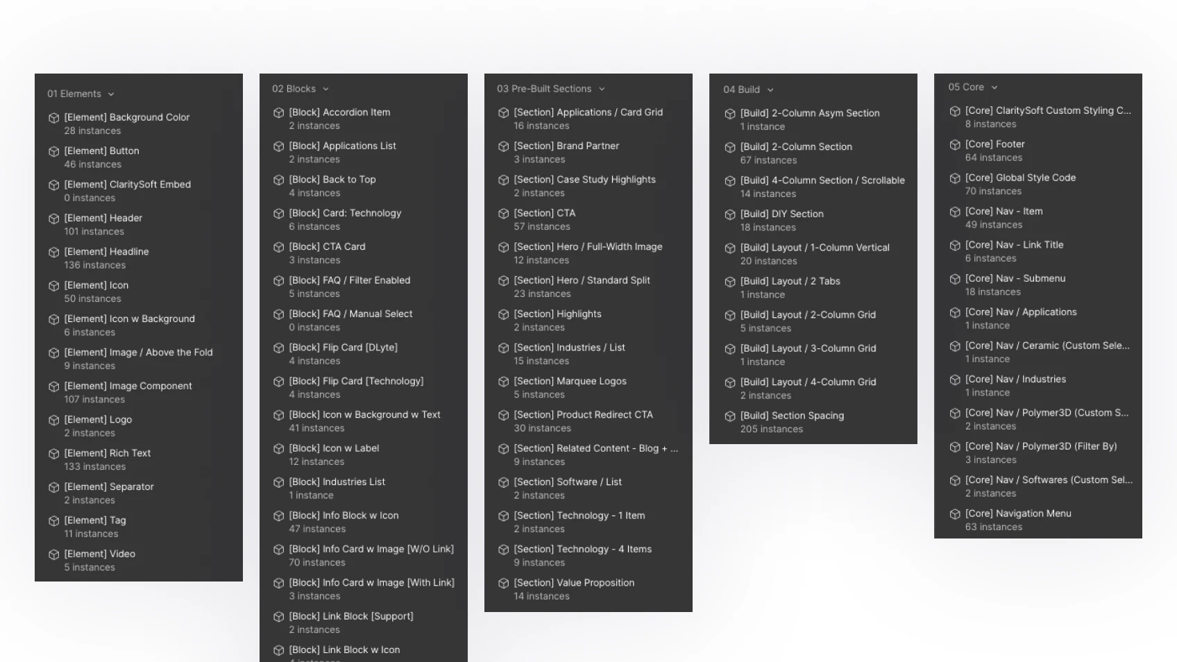
Comprehensive component system
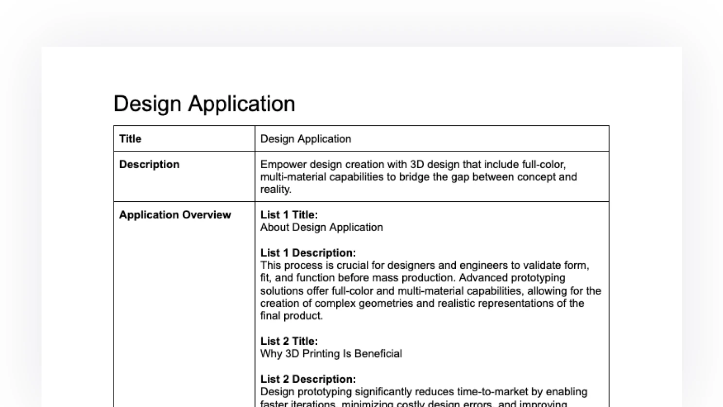
Built a layered set of components covering hero, product, technical-spec, and contact patterns, each with sensible defaults and clear variants.
WhyA well-modelled component system collapses the decision space at edit time and shortens the path from idea to live page.
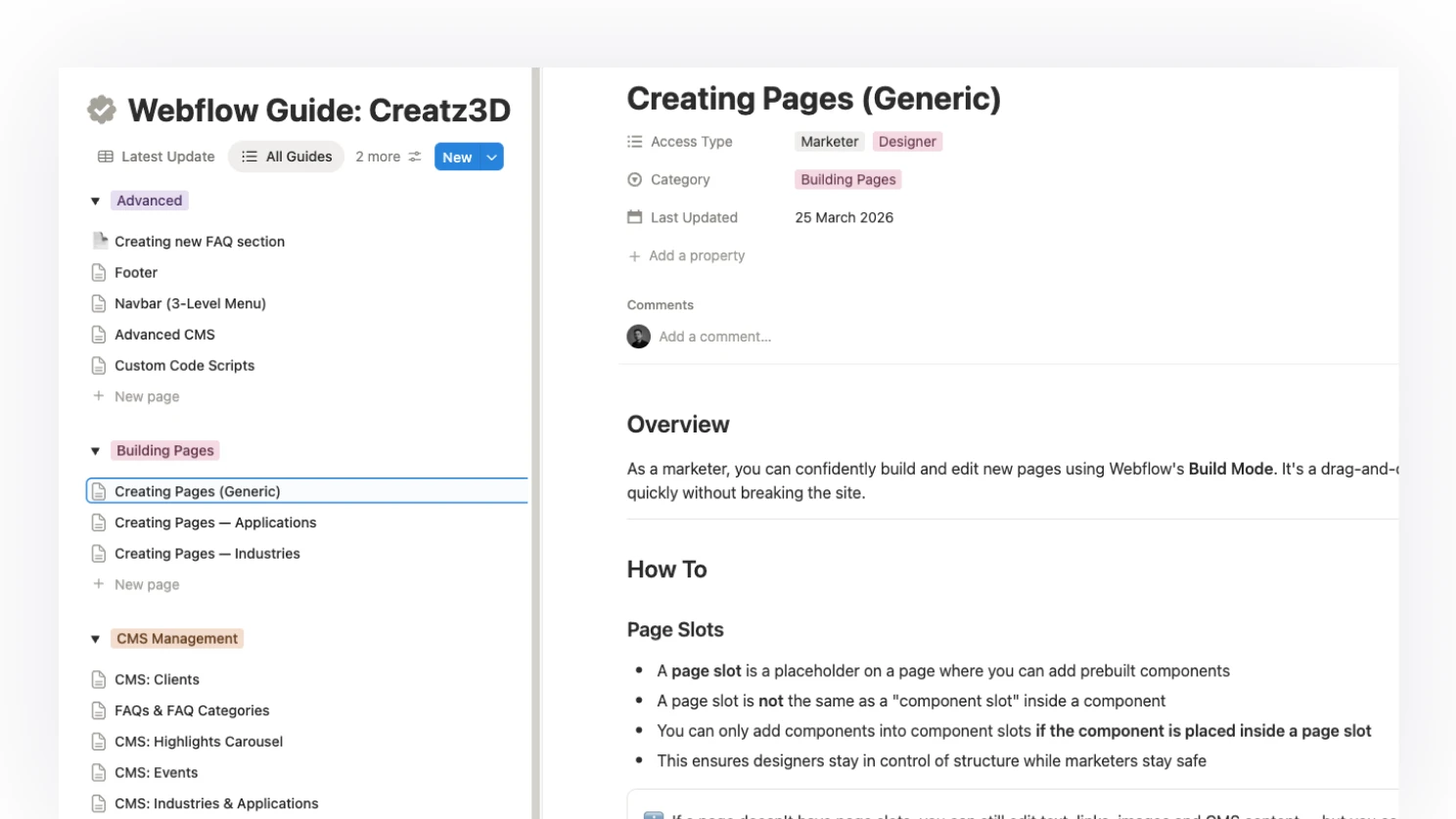
Digestible documentation and guides
Wrote step-by-step usage guides directly inside Webflow's CMS so the marketer could self-serve common tasks without pinging the dev.
WhyDocs that live where the work happens get used. A separate wiki gets ignored.
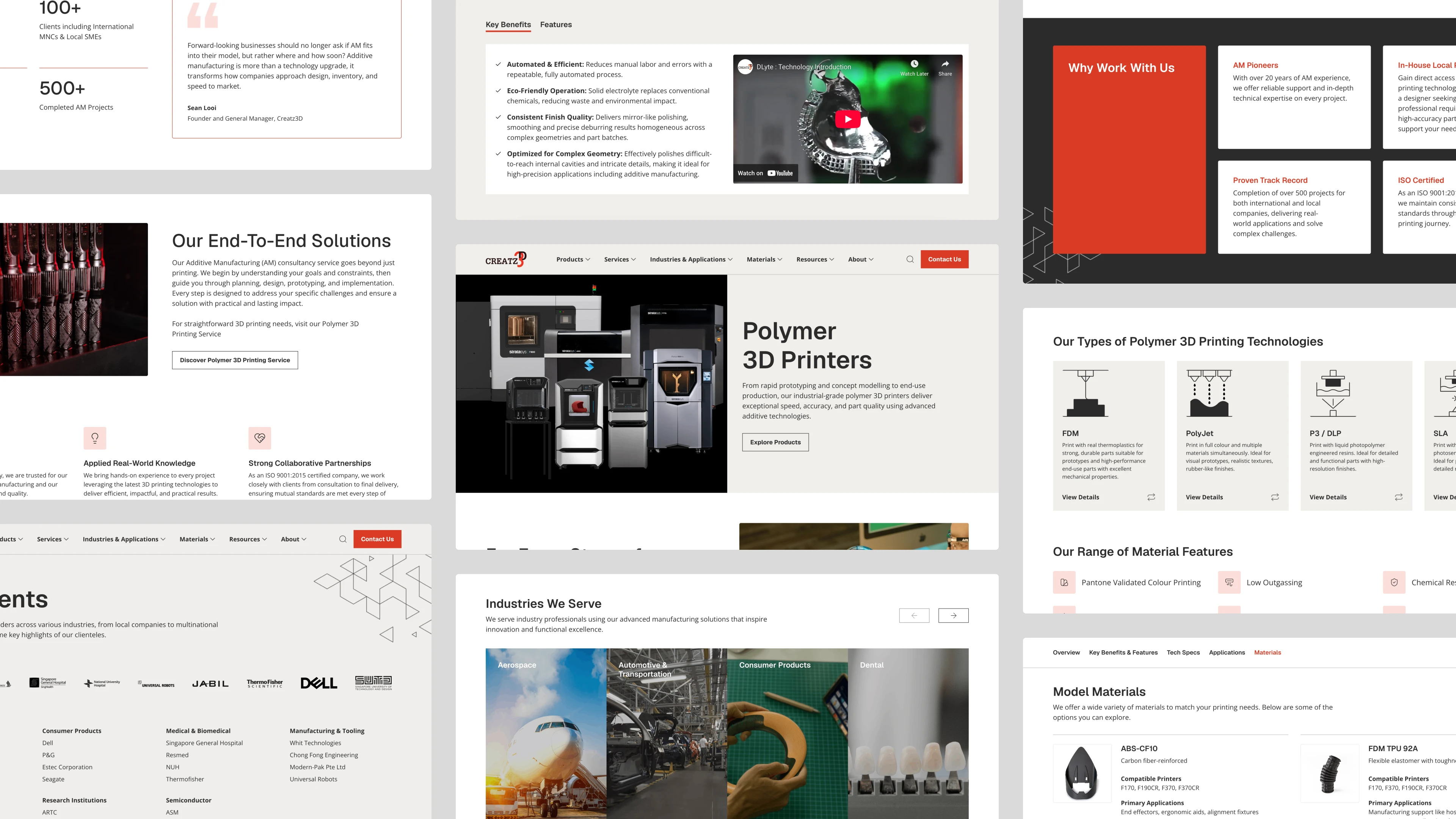
The successes of the new internal experience also let us focus the public-facing redesign on the real users: time-pressed B2B buyers who need to compare specs, find detail, and start a conversation fast.
Technical Comparison
Designed a side-by-side comparison for printers and materials, surfacing the spec rows engineers and procurement actually filter on.
WhyComparison is the unit of work for technical buyers. Anything else is detour.
Filter search across technical specs
Search and filtering across build volume, materials, tolerance and certifications, so buyers land on the right product in two or three clicks.
WhyB2B buyers come in with a spec sheet in mind. Match the spec sheet, win the click.
Hidden technical details
Used progressive disclosure to keep the page scannable while still surfacing depth for buyers who want it. Detail is opt-in, not enforced.
WhyTime-pressed users scan first and read second. Detail on demand respects the scan.
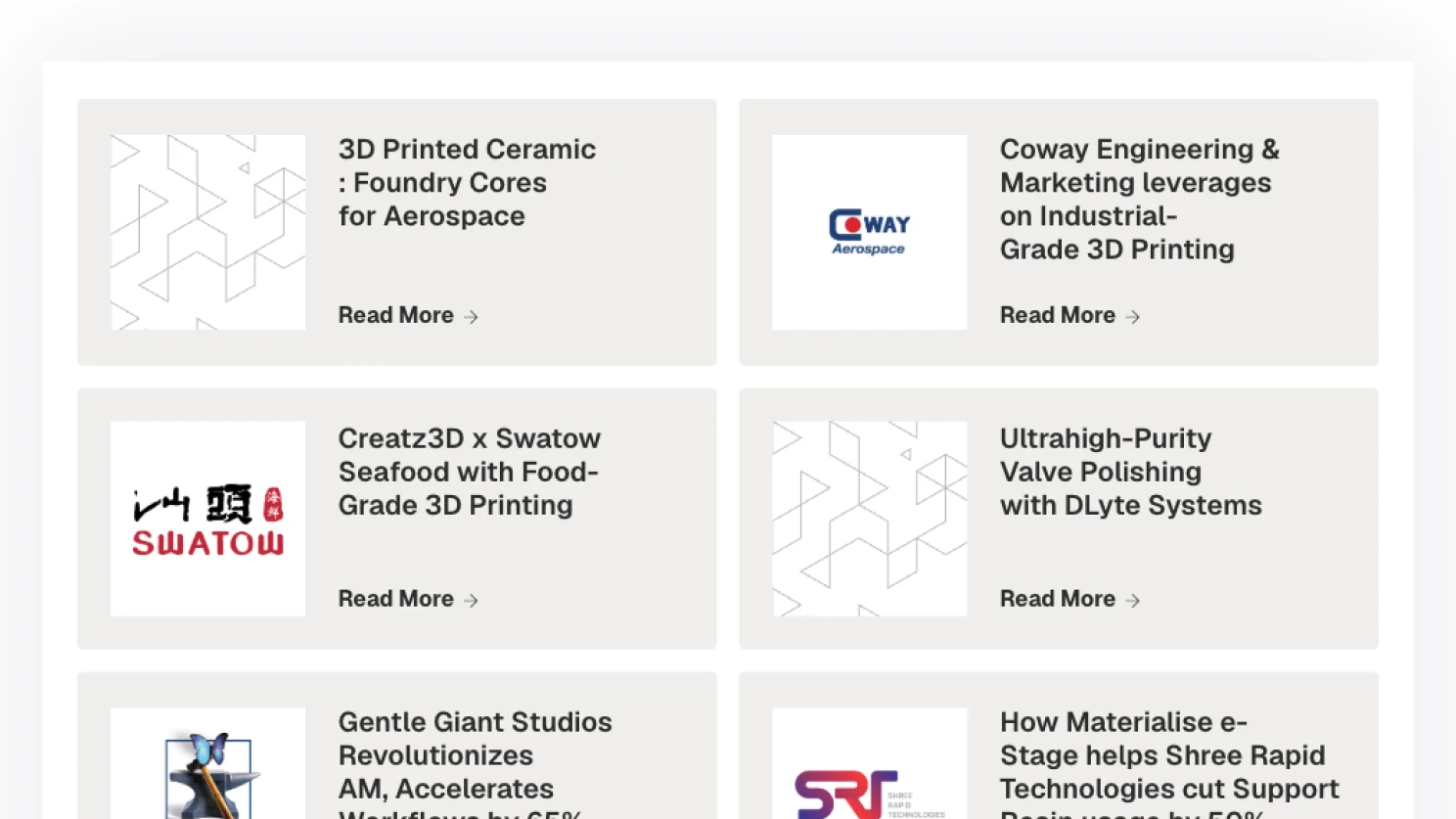
Refining details from Case Study
Restructured case studies around the buyer's question, from "what was made" to "what could we make for you", with a clear next step into a conversation.
WhyA case study is a sales conversation in disguise. Lead with what the buyer can do with it.
The biggest lesson was that a B2B redesign is a business intervention, not just an aesthetic refresh. Cutting low-value pages, simplifying the path to contact, and rebuilding for a single marketer changed how the site earns its keep, well before any pixel decision mattered.