Making Car Insurance Comparison Simple, Across Singapore & Hong Kong
car insurance shipped across Singapore and Hong Kong
faster loads, removing friction for time-pressed buyers
As Lead Product Designer for MoneyHero Group's insurance vertical, I owned the car insurance quote, results and comparison experiences across Singapore and Hong Kong. I turned one of the most complex comparison flows in fintech into a clear, shippable, two-market experience under tight timelines, while partnering closely with PM and engineering leads.
Senior Product Designer, promoted to Lead Product Designer for the insurance vertical. Owned insurance design end-to-end, led the team, set the quality bar.
1 designer. 4 dev. 1 PM.
2024
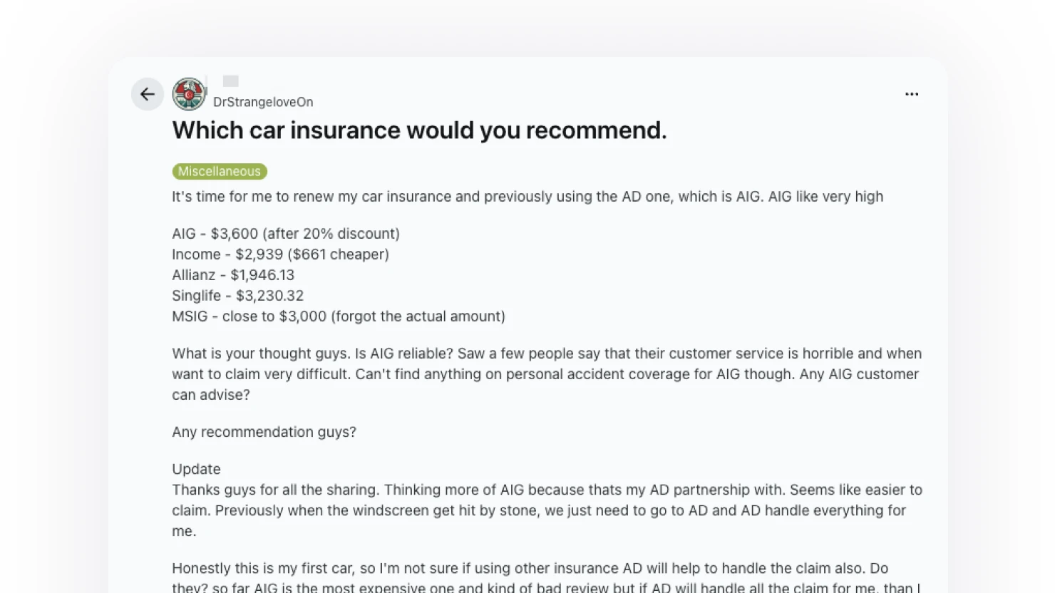
Car insurance in Singapore and Hong Kong sits in an unusual category. It is mandatory, regulated, often the second-largest motoring cost after the car itself, and bought by people whose relationship to driving varies wildly.
Mandatory and high-stakes.
Every driver must hold valid cover, premiums can run into the thousands, and the no-fault system means the policy chosen genuinely matters at the worst possible moment.
A category most people do not enjoy shopping for.
Plans are dense, exclusions are buried, and the existing market journey on competitor sites (a nine-step flow heavy on manual form-filling, with eligibility pop-ups late in the process and visible provider-API latency) sets a low bar that users come in braced for.
Quote and comparison directly drive revenue for the company.
Click-outs to providers are the moment the business gets paid and the moment the user commits, so clarity and trust at that point were non-negotiable.
How might we help any driver get to the right car insurance quote, across two markets, without exposing the complexity underneath?
Before touching the surface, we did the unglamorous work of understanding who was actually buying, what they had to put up with today, and what the system could realistically deliver.
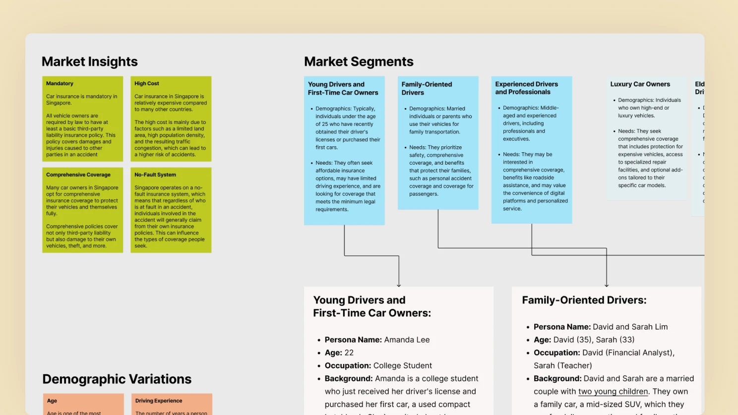
User research and segmentation. Built persona archetypes covering the real spread of the market: young first-time owners on tight budgets needing basic legal cover and easy online access, family-oriented drivers prioritising safety, comprehensive coverage and roadside assistance, and experienced professionals who valued premium service, specialised repair networks and a clean digital flow.
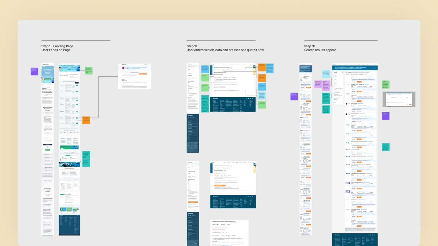
Heuristics evaluation of the existing journey. Mapped the competitor purchase flow end-to-end, from landing page through to the Stripe payment screen, across nine steps and both desktop and mobile.
Mobile data density was a delicate craft problem.
Comparing dense insurance data on a small screen meant deciding what to show, when, and what to defer behind a tap.
API fetch time had to be designed for, not ignored.
Pulling quotes from provider APIs takes real time, so loading and skeleton states were treated as a first-class part of the experience, not a placeholder.
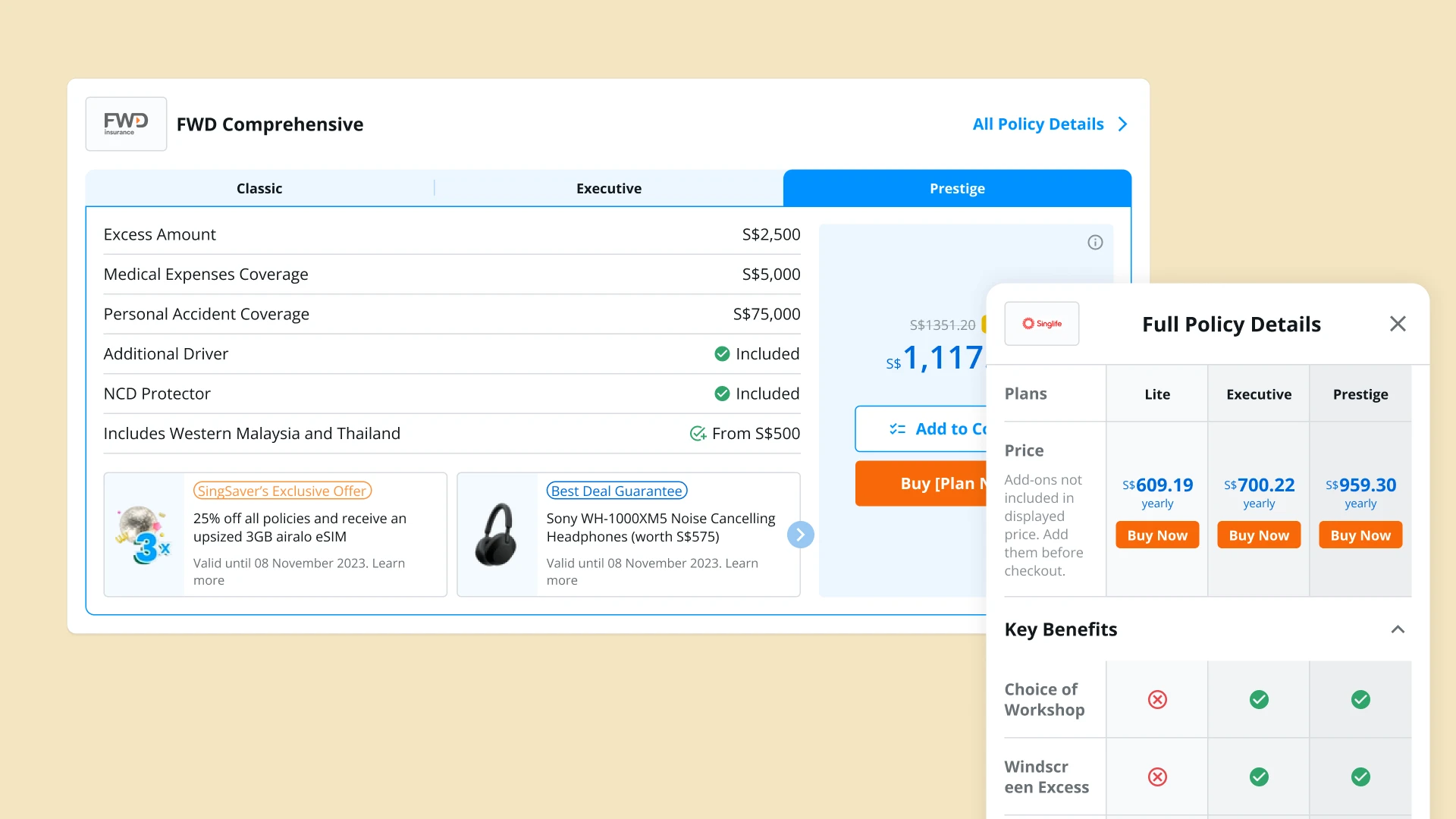
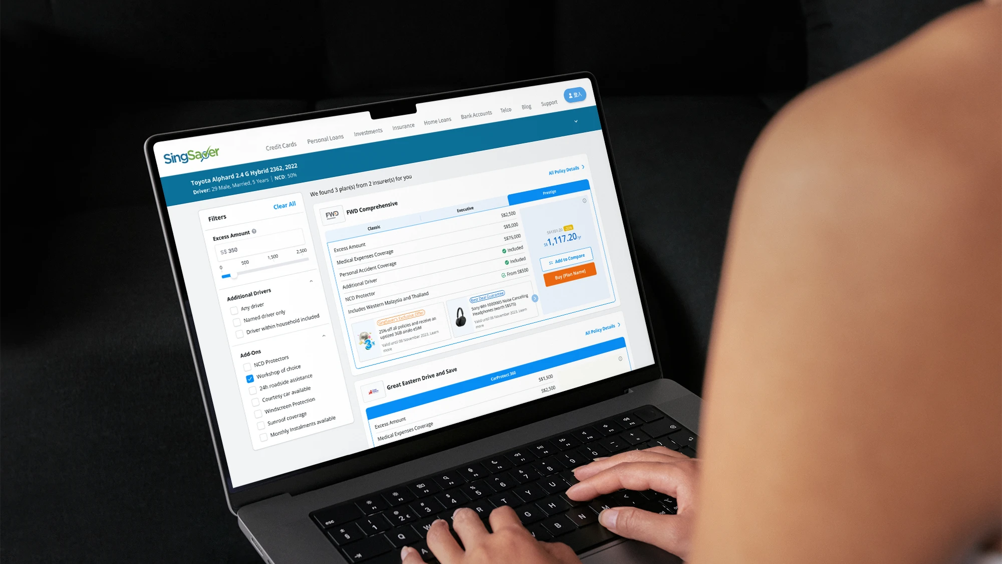
Different plans needed different presentations.
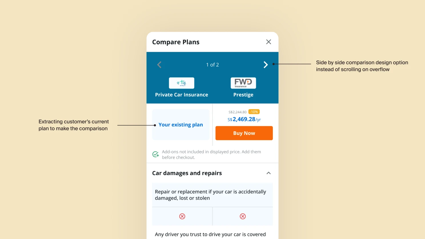
There are close to 30 types of plans available. Comprehensive, third-party and other plan types each carried different data, so the results page had to handle multiple permutations cleanly without fracturing into bespoke layouts.
The successes of the A/B test variant also allowed us to garner more resources and expand the project to a full-fledged revamp of the application journey. The goal remained the same: drive leads and reduce drop-off for applications.
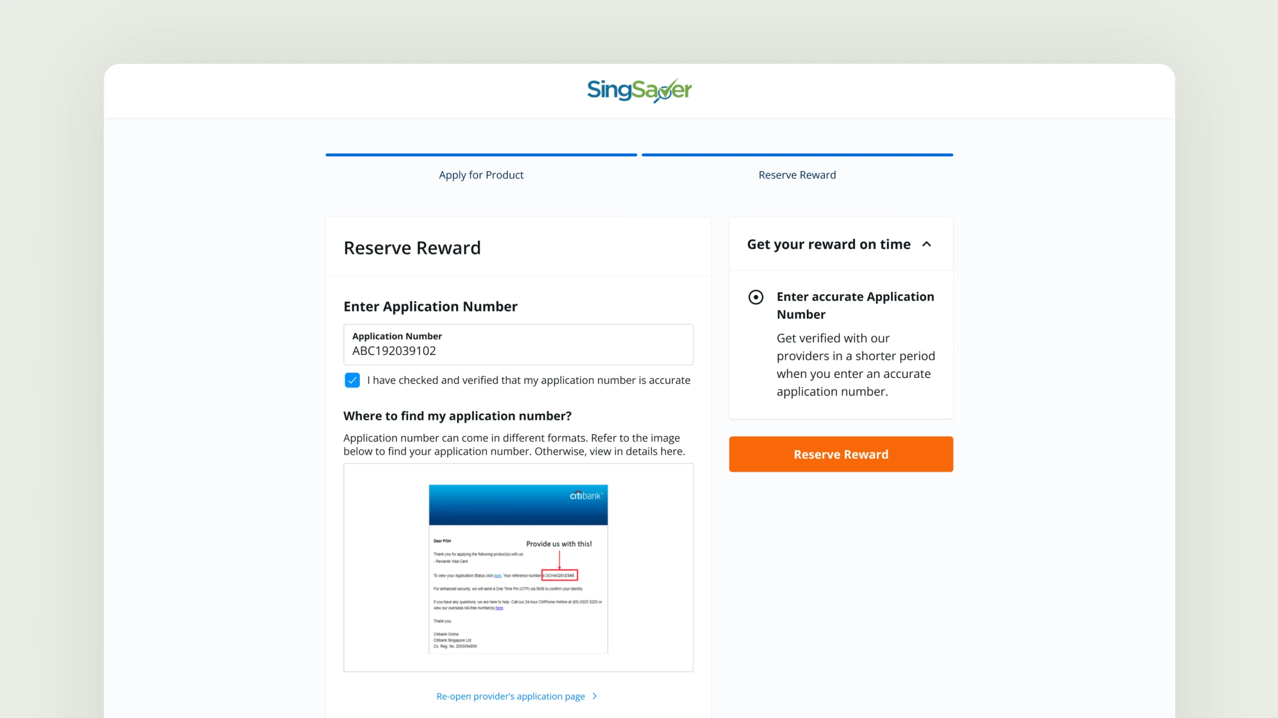
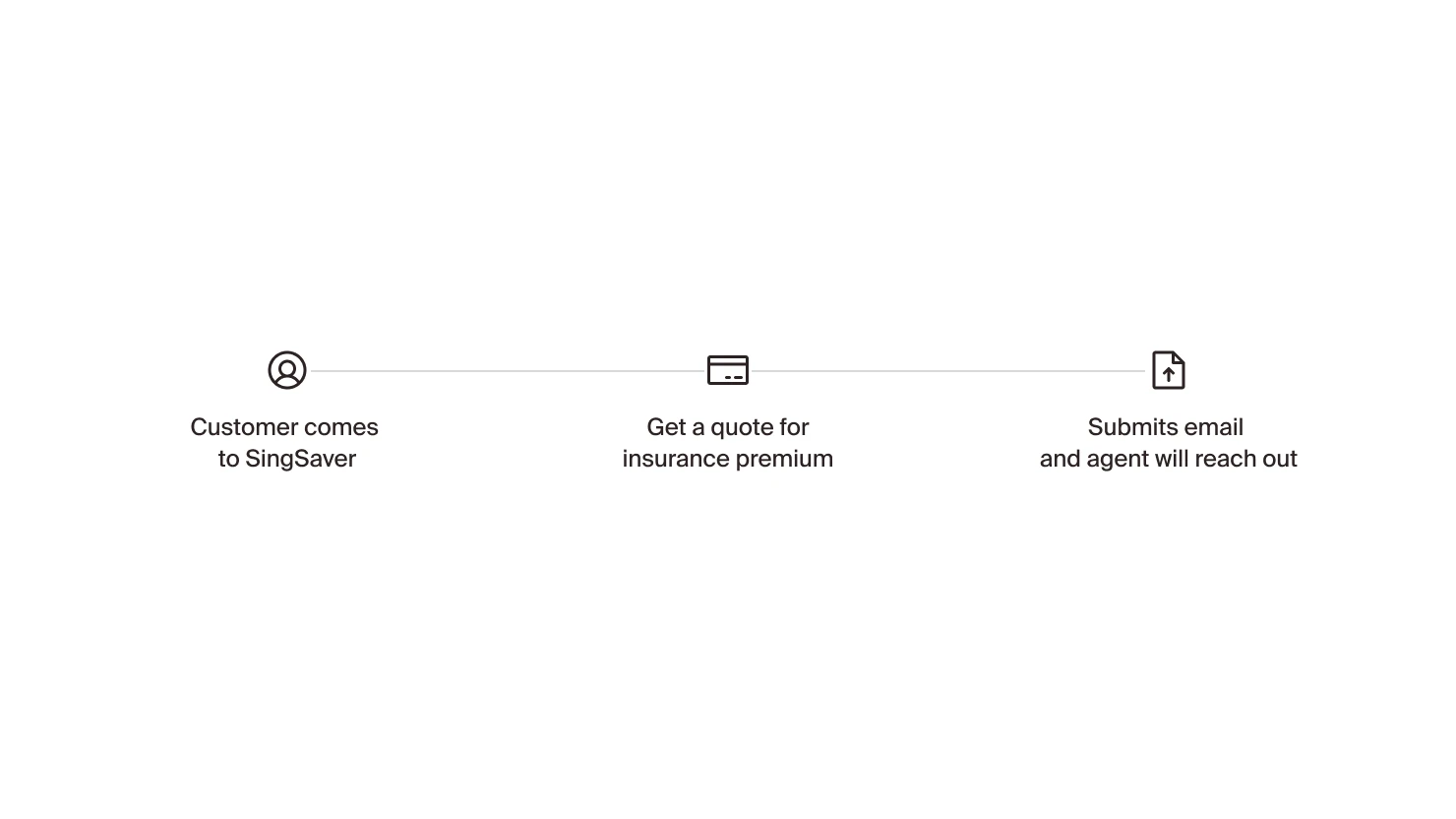
Simplify the most complex input: the request-quote flow
Designed the request-quote journey for both mobile and desktop, breaking a dense input into a guided flow that asks for the right detail at the right step.
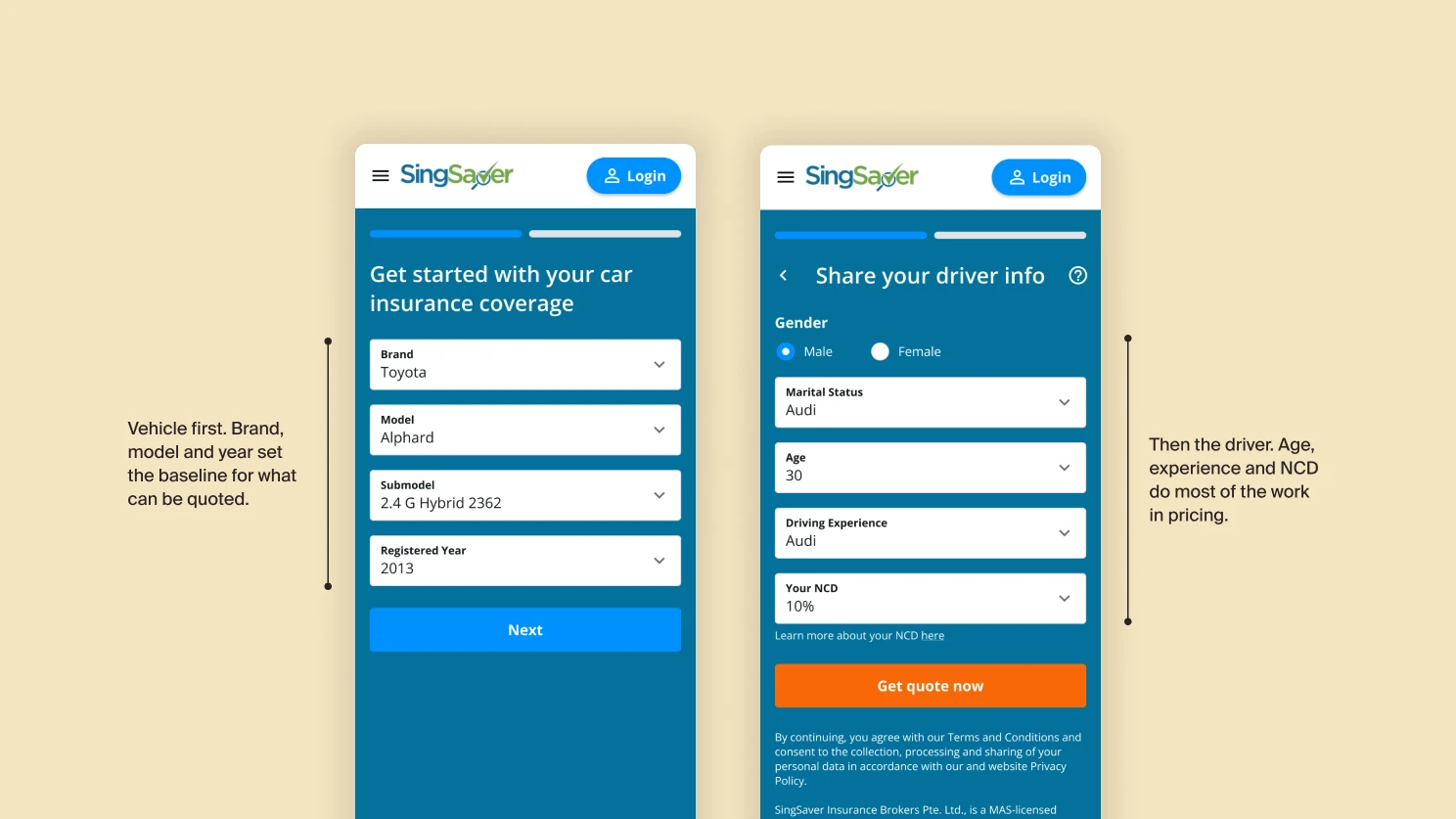
Displaying information as needed
Surfaced fields progressively, only asking for detail when it's needed to compute the next step. This lowered the perceived weight of the form and reduced abandonment in the dense middle section.
WhyFriction in the wrong place hurts; friction in the right place reassures. Showing every field at once is friction in the wrong place.
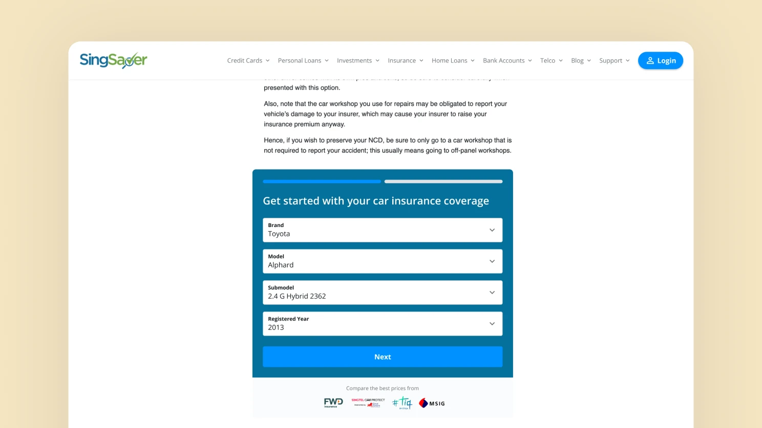
Cross page usage
The quotation page is also used across various pages such as the blog as part of the embed to drive lead acquisition.
Displaying the results
Built the results page to handle close to 30 plan permutations without fracturing into bespoke layouts, while making provider-API latency feel intentional rather than broken.
Skeletal loading
Designed skeleton states matched to the final layout, so the page never reflows when real data lands. Loading reads as progress, not as broken.
WhyProvider APIs take real time. Treating the wait as a designed state, not a placeholder, is the difference between a credible page and a janky one.
Comparing Experience
Designed the side-by-side comparison so buyers could resolve the question that actually closes the sale: which plan is right for me, given what I drive and what I'm willing to pay?
Accounting for mobile comparison experience
On mobile, side-by-side breaks. Designed a swipeable plan switcher with a pinned attribute column, preserving the comparison mental model without forcing a desktop layout onto a small screen.
Legacy in tech happens almost every other time when new tech is introduced. Often time as designers, we would like to dive head in to criticise experiences but as projects get involved deeper, it is often how the tech infrastructure is that affects how we work around constraints and challenges. This project was largely frontend heavy as we rely heavily on external party APIs.